


分享一个用css制作的家族图谱效果,当你的鼠标悬浮在菜单上,会高亮显示子节点的菜单。
0、请不要问“在不在”之类的问题,有问题直接问!1、学生或暂时没有工作的童鞋,整站资源免费下载!2、¥9.9充值终身VIP会员,加我微信,826096331 拉你进VIP群学习!3、程序员加油,技术改变世界。在线 充值
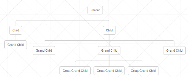

结构图HTML代码
<div class="tree">
    <ul>
        <li>
            <a href="#">Parent</a>
            <ul>
                <li>
                    <a href="#">Child</a>
                    <ul>
                        <li><a href="#">Grand Child</a></li>
                    </ul>
                </li>
                <li>
                    <a href="#">Child</a>
                    <ul>
                        <li><a href="#">Grand Child</a></li>
                        <li>
                            <a href="#">Grand Child</a>
                            <ul>
                                <li><a href="#">Great Grand Child</a></li>
                                <li><a href="#">Great Grand Child</a></li>
                                <li><a href="#">Great Grand Child</a></li>
                            </ul>
                        </li>
                        <li><a href="#">Grand Child</a></li>
                    </ul>
                </li>
            </ul>
        </li>
    </ul>
</div>
CSS
.tree {
    width: 760px;
    margin: 40px auto 0 auto
}.tree ul {
    padding - top: 20px;
    position: relative;

    transition: all 0.5s; - webkit - transition: all 0.5s; - moz - transition: all 0.5s;
}

.tree li {
    float: left;
    text - align: center;
    list - style - type: none;
    position: relative;
    padding: 20px 5px 0 5px;

    transition: all 0.5s; - webkit - transition: all 0.5s; - moz - transition: all 0.5s;
}

/*We will use ::before and ::after to draw the connectors*/

.tree li: :before,
.tree li: :after {
    content: '';
    position: absolute;
    top: 0;
    right: 50 % ;
    border - top: 1px solid#ccc;
    width: 50 % ;
    height: 20px;
}.tree li: :after {
    right: auto;
    left: 50 % ;
    border - left: 1px solid#ccc;
}

/*We need to remove left-right connectors from elements without
            any siblings*/
.tree li: only - child: :after,
.tree li: only - child: :before {
    display: none;
}

/*Remove space from the top of single children*/
.tree li: only - child {
    padding - top: 0;
}

/*Remove left connector from first child and
            right connector from last child*/
.tree li: first - child: :before,
.tree li: last - child: :after {
    border: 0 none;
}
/*Adding back the vertical connector to the last nodes*/
.tree li: last - child: :before {
    border - right: 1px solid#ccc;
    border - radius: 0 5px 0 0; - webkit - border - radius: 0 5px 0 0; - moz - border - radius: 0 5px 0 0;
}.tree li: first - child: :after {
    border - radius: 5px 0 0 0; - webkit - border - radius: 5px 0 0 0; - moz - border - radius: 5px 0 0 0;
}

/*Time to add downward connectors from parents*/
.tree ul ul: :before {
    content: '';
    position: absolute;
    top: 0;
    left: 50 % ;
    border - left: 1px solid#ccc;
    width: 0;
    height: 20px;
}
友情提示:垃圾评论一律封号 加我微信:826096331拉你进VIP群学习群